Somewhere between “Final proof approved” and “Upload manuscript”, almost every first-time indie author makes an unsettling discovery.
The manuscript is finished.
The book isn’t.
“Trim size? What is THAT?” my clients gasp when I mention this phase of book publishing. I mean this is something one could do oneself, and if you are on a major budget i would recommend that, but… it takes time, skill, and patience.
This tends to become apparent at approximately 11.47 p.m., when you are sitting in front of Atticus, InDesign, Reedsy, or Word wondering why Chapter Seven has acquired a blank page, the page numbers have migrated into the gutter, one photograph is apparently trying to escape the book altogether, and changing a heading on page 42 has somehow reorganised Western civilisation from page 43 onwards.
Welcome to your essential book interior formatting guide for the separate publishing stage many new authors don’t know exists until they are already doing it. And it matters considerably more than simply choosing a nice font.
Editing determines what the book says. Interior design determines how comfortably, confidently and intelligently the reader can receive it.
Why Every Author Needs a Book Interior Formatting Guide
Your manuscript is a working document.
Its job was to help you write, revise, edit and proof your content. It probably contains headings, paragraphs, page breaks, perhaps some images, and whatever assortment of styles survived six months of Track Changes.
A finished book interior has a different job.
It must create a coherent visual system.
The reader needs to know instinctively where they are. Chapter openings should feel like chapter openings. Main headings should outrank subheadings. Quotes, exercises, examples and sidebars should be visually distinguishable without requiring a small explanatory manual. Pages need enough breathing room to be comfortable without creating a 486-page book whose printing cost requires a mortgage.
And the physical mechanics matter too. Print books require decisions around trim size, mirrored margins, gutters, bleed, pagination and image resolution. Amazon’s own KDP guidance treats interior formatting as a distinct production process involving trim size, margins, styles, chapters, front matter, pagination, headers, images, contents pages and finally PDF proofing. It also notes that incorrect bleed is one of the common reasons files fail quality review.
In other words, the publishing platform itself does not consider formatting to mean make it look pretty.
Neither should you.
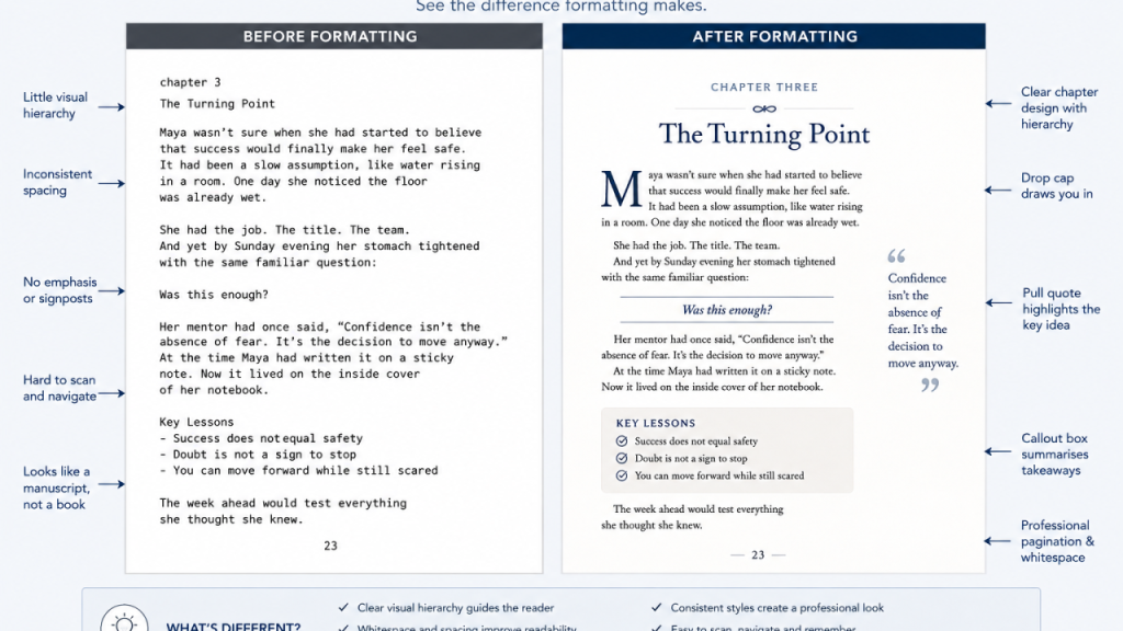
Good fiction formatting is designed to disappear
This often surprises authors.
Fiction interiors generally need less visible design, not more.
If I am reading your murder mystery, you ideally do not want me pausing halfway through the discovery of the body to admire your imaginative typography.
A strong fiction interior might use a carefully chosen serif body font, comfortable line spacing, consistent first-line indents, restrained chapter openings, a small ornament or dinkus for scene breaks, and perhaps a complementary display font for chapter titles.
The design creates mood without continuously announcing itself.
A chapter opening could be as simple as:
CHAPTER SEVEN
The House on Long Street
The rain had stopped by the time Anna reached the gate.
You might remove the indent from that first paragraph, then return to normal indented paragraphs thereafter. Perhaps the chapter begins lower down the page. Perhaps there is a subtle ornament above the title that echoes something from the cover.
That can be enough.
What normally doesn’t help is this:
- Chapter heading in one decorative font.
- Subtitle in another.
- A giant drop cap in a third.
- Body text in a fourth.
- Extra spaces between every paragraph and paragraph indents.
- Little flourishes between scenes, under chapter headings, beside page numbers and possibly roaming independently through the margins.
At that point, the reader is no longer inside the story. They are attending the font convention.
Non-fiction has a different job
A non-fiction reader is often not travelling through your book in a straight line.
They stop. Scan. Go backwards. Look something up. Return to a useful section. Skim a chapter they think they already understand before discovering that they don’t. Good non-fiction formatting therefore needs stronger information hierarchy and visual signposting.
Take a relatively ordinary passage about leadership.
You could present three uninterrupted pages discussing psychological safety, communication, employee silence and management behaviour.
Perfectly readable.
Or you could build a hierarchy around it:
WHY GOOD EMPLOYEES STOP TALKING
The silence problem usually begins long before anybody resigns.
Body text explains the issue.
The Silence Trap
More body text develops the argument.
People rarely stop speaking because they have nothing to say. They stop because experience has taught them what happens when they say it.
Then perhaps:
TRY THIS At your next management meeting, ask each team member to identify one decision they disagree with—and make disagreement safe before asking them to provide it.
Then continue into the chapter.
Same underlying information.
Completely different reading experience.
Pull quotes, callouts, eyebrows and all the other things apparently living inside your book
Non-fiction gives us a much larger design toolbox, although having access to the toolbox does not mean emptying its entire contents onto every page.
A pull quote takes an interesting sentence or short passage already contained in the surrounding text and enlarges or separates it visually. Its purpose is to catch the scanning reader’s eye and draw them into the section. Pull quotes are sometimes described as callouts, although a callout can also be a fact box, instruction, label, warning, diagram note or other element deliberately directing attention.
A pull quote might be:
Your book should make the important ideas easier to find—not make every idea look important.
If you pull out fourteen quotes in a six-page chapter, nothing is being pulled out anymore. You have simply created a second book floating around inside the first one.
Callout boxes are particularly useful for practical non-fiction. They can hold exercises, warnings, definitions, examples, case studies, reflection questions or quick summaries.
For example:
WATCH FOR THIS: If your heading needs three sentences underneath it explaining what the heading means, the heading probably isn’t doing enough work.
An eyebrow or kicker is a small piece of text appearing above a larger heading, often identifying a theme, section or category. A deck generally sits underneath a headline or major heading and briefly expands on what follows. These terms originated largely in newspaper and magazine design, where visual signposts help readers understand the structure before committing to a section.
For a business book, for example:
THE PEOPLE PROBLEM ← eyebrow/kicker
Why Smart Teams Stop Speaking ← heading
The behaviour you call disengagement may actually be something your organisation has trained people to do. ← deck
Then the chapter begins.
You also have subheads, numbered processes, sidebars, tables, diagrams, checklists, captions, timelines and breakout examples available to you.
The important word, however, remains available.
Not compulsory.
If everything screams, nothing gets heard
This is one of the most common DIY non-fiction design problems I see.
The author has discovered boxes. This is initially exciting.
Soon we have blue boxes for tips, grey boxes for quotes, orange boxes for exercises, green boxes for case studies and perhaps a tasteful beige box whose purpose nobody can now remember. There are icons. There are arrows. There are five heading levels. Half the body text has become bold because it was all terribly important.
The resulting page looks less like a book and more like someone’s cat threw up on the page.
Visual hierarchy only works because some things are quiet.
The ordinary body text gives the emphasis somewhere to stand.
Good interior design doesn’t decorate information. It tells the reader what matters, what belongs together and where to look next.
Print and ebook formatting are not the same job
This distinction causes enormous frustration for new authors because the beautifully designed print page they have spent three hours perfecting may be precisely what they cannot reproduce in a normal ebook.
A printed page is fixed.
You control where almost everything sits.
An ordinary ebook is usually reflowable. The reader can enlarge the type, change fonts, alter spacing, rotate the device and read on anything from a phone to an e-reader. Amazon specifically describes text-heavy fiction and non-fiction ebooks as reflowable because the text must reorganise itself as the reader changes display settings.
That means your gorgeous pull quote sitting exactly halfway down page 137 beside paragraph four does not really have a page 137 to sit on anymore.
And that is fine.
A well-made ebook should behave like an ebook.
A print book should behave like a print book.
There are fixed-layout ebooks for material where exact positioning is essential—such as some children’s books, comics, textbooks and heavily illustrated books—but standard fiction and text-led non-fiction normally benefit from reflowable design. Adobe’s current EPUB tools similarly distinguish between reflowable books, where adaptability and readability take priority, and fixed layout for image-rich or highly controlled designs.
Understanding the difference between fixed print pages and reflowable EPUBs is a core lesson in any book interior formatting guide. Trying to force print design intact into a reflowable eBook is one of publishing’s more reliable ways of acquiring several new swear words.
So, what actually happens during print formatting?
A professional print-formatting process is roughly this:

KDP’s current specifications, for example, require different gutter allowances depending upon page count, and elements intended to run to the edge must extend beyond the trim line to allow for cutting. KDP recommends PDF for print and requires it where the interior contains bleed.
Which is why the correct response to:
“But the margins looked fine on my laptop.”
is sometimes:
“Yes. Unfortunately, the printer remains unmoved by this.”
The ebook goes through a different process
The digital edition usually begins from the same clean content but needs different thinking.
- You establish proper heading and paragraph styles.
- Remove print-only elements such as running headers and meaningless page references.
- Build a navigable contents structure.
- Ensure images work when resized.
- Replace manual spaces, tabs and repeated returns with actual structural formatting.
- Keep decorative elements simple enough to survive different devices.
- Check hyperlinks and back matter.
- Add appropriate accessibility information to meaningful images where needed.
- Export the EPUB.
- Then test it.
- And test it again on more than one screen.
Because “it looked fine on my Kindle app” does not automatically mean it will look fine on somebody else’s Kobo, iPad or phone.
Choosing Software for Your Book Interior Formatting
This is where I am going to say something slightly unfashionable.
Sometimes Word is exactly the right tool.
Not because Word is the world’s finest page-layout application.
It isn’t.
But not every novel requires InDesign any more than every trip to the supermarket requires a helicopter.

Atticus currently works across Windows, Mac, Linux and Chromebook, exports EPUB, PDF and DOCX, includes templates and custom themes, and supports features such as callout boxes. Its US$147 price is a one-time payment.
Vellum remains Mac-only. Its current Press license is US$249.99 for unlimited print and eBooks, and it automatically handles features such as margins, headers, footers, widows and spread balancing across 24 trim sizes.
Reedsy Studio’s core writing and formatting functions remain free and can export both EPUB and print-ready PDF, although the trade-off for that simplicity is a more template-led design environment.
And InDesign remains the serious layout workhorse when you need proper page-level design control. It can now export both reflowable and fixed-layout EPUBs and gives considerably more control over structure, CSS, accessibility, images and reading order—but Adobe’s current standalone plan is US$22.99 a month on an annual commitment, and the learning curve is correspondingly less cuddly.
Why we sometimes still use Word
Because Word is considerably more powerful than most authors realise.
Microsoft Word supports section breaks specifically so different parts of the same document can carry different headers, footers, pagination, columns and page layouts. Chapters can begin on odd or even pages, numbering can begin later, and proper use of styles allows global changes without manually attacking 324 pages one heading at a time.
Amazon itself provides detailed instructions for producing paperback interiors in Word.
That should perhaps settle the argument that Word is somehow inherently “unprofessional”.
For a straightforward novel, memoir or text-led business book, Word can be fast, stable, editable and remarkably effective in the hands of somebody who understands styles, sections, fields, mirrored margins and the slightly malicious personality of its header system.
It also has one enormous practical advantage during the final production phase:
Almost everybody can open it.
If the author spots a typo, the editor wants to check a reference or somebody decides the acknowledgements should mention Aunt Mavis after all, nobody needs specialist design software merely to understand the file.
Where I would not choose Word first is a heavily illustrated coffee-table book, workbook with complex graphical elements, textbook, image-rich technical book or anything requiring sophisticated page-by-page art direction.
Sometimes the helicopter is justified.
A real example of why formatting is a separate publishing stage
We recently worked on a revised edition of a book where the new manuscript contained more than 10,000 revisions compared with the earlier version.
At first glance, you might imagine we could simply open the existing interior and replace the changed words.
Except changed words change line lengths.
Changed line lengths change paragraphs.
Paragraphs move onto different pages.
Images move.
Chapter openings move.
Contents-page numbers move.
And suddenly the old “finished” layout is behaving rather like a knitted jumper after someone pulls one loose thread. The sensible solution was to rebuild the interior from the new final manuscript rather than spend hours patching an old layout page by page.
This is also why I strongly recommend doing major editing before final formatting. You can certainly make corrections afterwards. We do it all the time. You just don’t particularly want to restructure Chapter Four after someone has carefully typeset Chapters Four through Nineteen around it.
What works—and what usually doesn’t
For fiction, restraint works. A clear body font, consistent paragraphs, attractive chapter openings and subtle genre cues generally outperform elaborate page decoration.
For narrative non-fiction and memoir, you can add slightly stronger chapter personality, photographs, epigraphs or section dividers while still allowing the prose to dominate.
For business, leadership, psychology, self-help and instructional books, stronger hierarchy becomes useful. Subheads help scanning. Pull quotes reinforce memorable thinking. Boxes can separate exercises or examples. Tables can turn 600 words of comparison into something the reader understands in twenty seconds.
For workbooks and practical guides, white space itself becomes functional because readers may need to stop, think, write or act.
What usually doesn’t work is designing each page individually according to whatever looked interesting on Tuesday.
Good book design is a system. And consistency.
If an exercise looks one way in Chapter Two, it should not suddenly reincarnate as a lavender speech bubble in Chapter Nine.
And no, a template doesn’t make the design decisions for you
This is perhaps the most important point about Atticus, Vellum, Reedsy, and every other “easy book formatting” tool.
They are very useful. They are not taste.
A template can give you a technically attractive chapter heading. It cannot necessarily tell you whether your financial-management book should look authoritative, friendly, youthful, academic, luxurious or accessible.
It cannot decide whether the callout on page 62 genuinely helps the reader or merely exists because you discovered callouts on page 61.
It cannot decide whether an image deserves a full page, half a page or no page whatsoever.
And it certainly cannot tell you that the decorative script you’ve chosen for a serious book on bereavement makes the chapter headings look distressingly like wedding invitations.
Software executes design decisions. Somebody still has to make them.
Where Harvard Ink fits into this
Interior formatting is one of those publishing services authors often don’t know they need until they need it immediately.
At Harvard Ink, our approach to a book interior formatting guide isn’t just about applying a template. We design both print and digital interiors around the book itself…—not simply around whichever template happens to be fashionable. Sometimes that means a highly customised visual treatment. Sometimes it means deliberately keeping things beautifully simple.
And sometimes it means telling an author that, yes, Word will do the job perfectly well and there is absolutely no need to purchase three new programmes and spend the weekend becoming an amateur typesetter.
Based in South Africa and working internationally, we handle print and ebook formatting for authors publishing into international English-language markets. We can work with straightforward fiction, memoir and text-led books as well as more designed non-fiction containing images, tables, exercises, pull quotes, callouts and other visual structure.
As with everything else we do, we keep the number of book projects limited because formatting is not simply throwing a manuscript through software and accepting whatever emerges from the other side.
Someone should actually look at the book as a finished reading experience, not simply trust that the software has done its job. That means noticing a heading stranded at the bottom of a page, checking that a table is genuinely readable at print size, and catching the moment Chapter Eleven has somehow inherited Chapter Ten’s running header. These are small details, but together they are often what separates a book that merely functions from one that feels professionally produced.
A proofreader and QC check is vital at this point to notice this stuff. Preferably before your reader does.
Your cover may persuade someone to pick up your book. Your interior is where you prove that their trust was justified.
We are always open to chats with authors at any stage of the publishing process, whether you need the whole interior handled or simply want help deciding how complicated yours really needs to be. Book a free conversation here: https://calendly.com/harvardink-info/30min
Find out more about writing, editing, designing and publishing your book with Harvard Ink: https://harvardink.com/
Thank you for reading Part 4 of our series – The Indie Author’s Publishing Survival Guide. To read our other posts on self-publishing for authors and writers, they’re right here:
Read Part III of the series here.
Read Part V of the series here.
Originally published on LinkedIn August 31 2026. https://www.linkedin.com/pulse/indie-authors-publishing-survival-guide-your-manuscript-finished-lx9ue/


Pingback: How to Become an Amazon Bestseller (And What It Actually Means)